Configure a grid layout
To configure a grid layout, add a grid layout object and child objects and then change the properties of the grid layout.
You can define both grid layout columns and rows. If you define columns only, FactoryTalk Optix Studio defines rows automatically. If you define rows only, FactoryTalk Optix Studio defines columns automatically.
- Pixels
-
Absolute unit in pixels. For example, 100
- Frames
-
Proportional unit calculated based on the remaining space. For example, 2fr is two times wider than 1frTip: Using frames means that the space not occupied by columns with fixed width is split into the sum of frames. For example: 100;2fr;1fr means that the first column takes 100px, the second column takes 2/3 of the remaining space, and the third column takes 1/3 of the remaining space. If you stretch the grid layout, the first column width remains 100px while second and third column grows or shrinks to maintain the ratio.
- Auto
-
Dynamic unit. Use the auto keyword to determine the column width based on the content of the column.
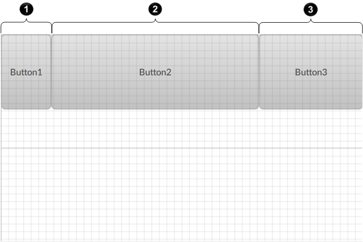
| Callout | Unit | Value | Description |
|---|---|---|---|
 |
Pixels | 100 | Fixed width of 100px |
 |
Frames | 2fr | 2/3 of the remaining space |
 |
Frames | 1fr | 1/3 of the remaining space |
- In Project view, right-click a node to contain the grid layout object and select .
-
(optional) Hover-over the grid layout, select
 , and then enter a custom name for the object.
-
Add or move child graphic objects under the grid layout.
For more information on how to move graphic objects, see Move a node.
For example, add buttons under the grid layout to create a grid of buttons. See Button.
-
In Project view, select the grid layout and configure grid columns:
-
In Properties, hover over the Columns value and select .
-
In the editor, select
 to add grid columns.
- Specify each column width by entering values or creating dynamic links.
Figure 2. Example: Grid layout with three columns 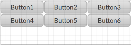
-
In Properties, hover over the Columns value and select
-
Configure grid rows:
-
In Properties, hover over the Rows value and select .
-
In the editor, select to add grid rows.
- Specify each row width by entering values or creating dynamic links.
Figure 3. Example: Grid layout with three columns and two grid rows 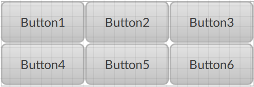
-
In Properties, hover over the Rows value and select
-
In Properties, set how to display the child graphic objects:
-
Horizontal gap. Horizontal space between child objects of the grid layout.
Figure 4. Grid layout with horizontal gap 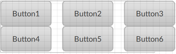
-
Vertical gap. Vertical space between the rows of wrapped child objects of the grid layout.
Figure 5. Grid layout with vertical gap 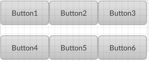
-
Items Horizontal Alignment. Horizontal alignment of child objects in grid cells.
Figure 6. Grid layout with child objects centered horizontally 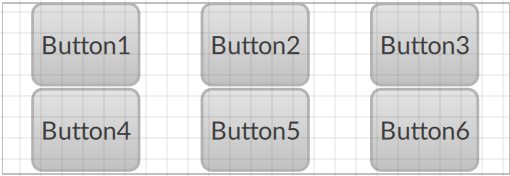
-
Items Vertical Alignment. Vertical alignment of child objects in grid cells.
Figure 7. Grid layout with child objects centered vertically 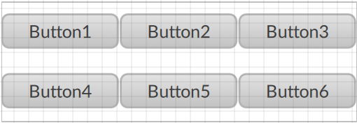
-